How to Trade Triangles in Trading: Symmetrical, Ascending, and Descending

Learn how to trade triangle patterns in crypto by looking at supply and demand mechanics. Discover why ascending, descending, and symmetrical triangles often fail and how to use cluster charts and heatmaps to identify the real direction of a breakout before it happens.
Table of contents

A triangle on crypto charts looks simple and clear. That is exactly why it is dangerous: the eye quickly draws a breakout where market participants have not yet decided anything. The triangle trading strategy usually comes down to a simple idea: trade in the direction of the trend.
The problem is that this pattern does not show the main thing — who is stronger at the moment, who is absorbing volume, and what happened before the pattern itself was formed. That is why the same picture on the crypto market can end in trend continuation, a false breakout, or a move out of the pattern in the opposite direction.
What the Triangles Pattern in Trading Actually Shows
What many traders call the triangles pattern in trading is an area where the price range gradually narrows, highs and lows start to converge, and volatility falls. Put simply, price action contracts and temporarily slows down. But the pattern itself is only a familiar shape on the charts. It does not explain why price stopped: because many participants were taking profits after an impulse move or, for example, because volume and activity fell.
If a crypto asset had already risen by a hundred percent before the pattern formed, the logic of buyers and sellers would be one thing. If what we have in front of us is a prolonged decline and selling no longer pushes the market lower, it is something else entirely. So it is better to treat the pattern not as a ready-made signal to act, but as a point where you need to analyze the market more carefully. There is no triangle trading indicator that can tell you this from the shape alone.
Types of Triangles in Trading
From a technical analisys point of view, the main forms are ascending, descending, and symmetrical.
Descending Triangle
In technical analysis, this pattern is considered a sign of pressure from sellers. Under that approach, it is supposed to be traded on a breakout in the direction of the downtrend.
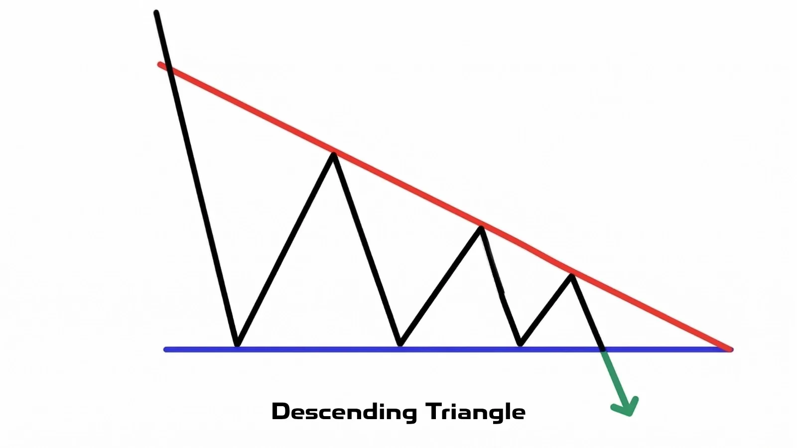
But that is not always true. Volume analysis makes it possible to assess the strength of participants more objectively. Let us look at examples.
Let us look at the market situation through the lens of supply and demand.
What do we see? Pay attention to delta and to the dynamics of the price move: after the coin’s strong growth, buying no longer produces the expected result (green box); every rebound is weaker and weaker, the seller keeps control of price, the buying is absorbed, a surplus is formed, and the pattern breaks downward.
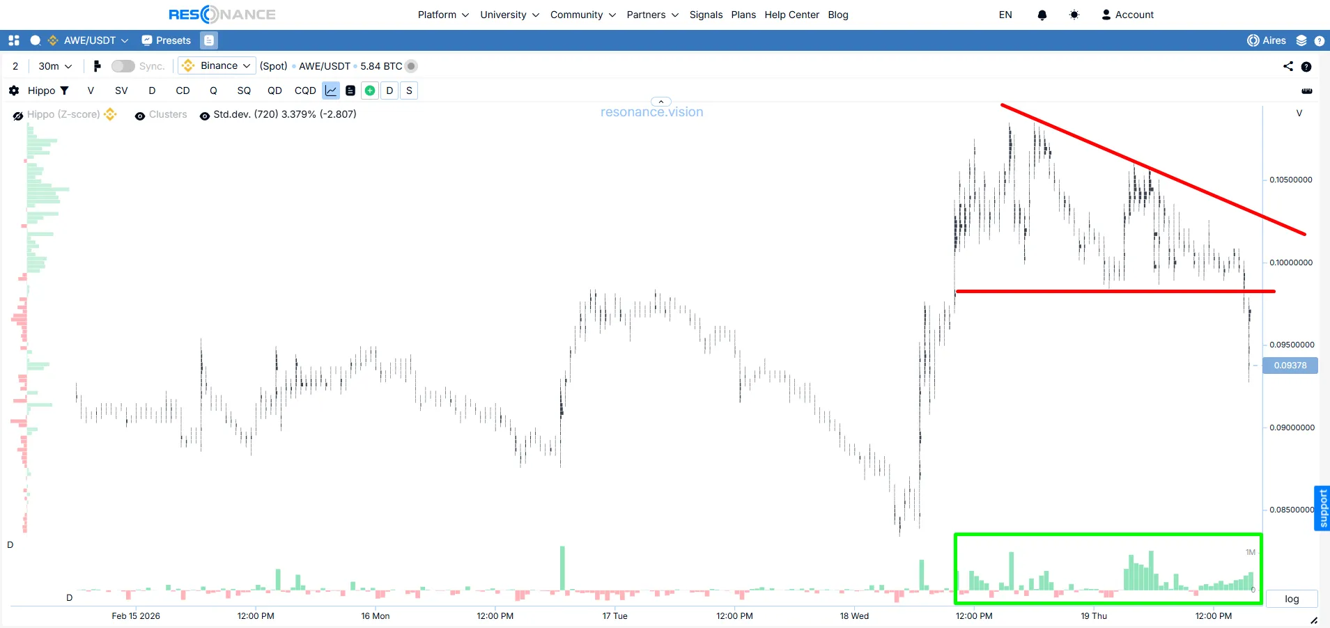
This is a classic example of buy-side absorption. All aggressive market demand runs into a wall of the seller’s limit orders.
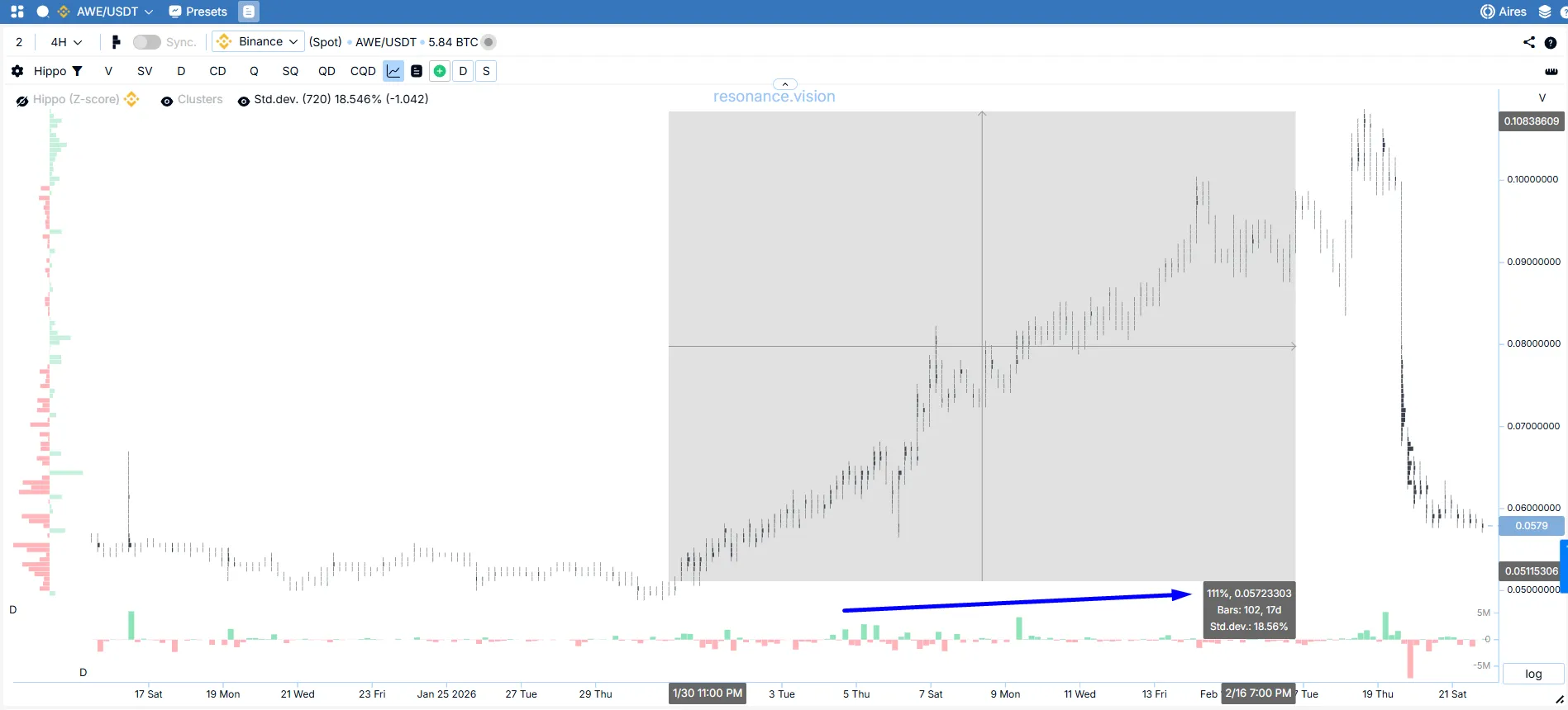
Notice how important context is. Before this absorption of buying, the asset had grown by 111%. It is logical to assume that after such an impulsive move, participants would start locking in positions, which is exactly what we saw through the absorption of buying. In cases like this, the probability of a correction rises sharply. In crypto, this happens all the time.
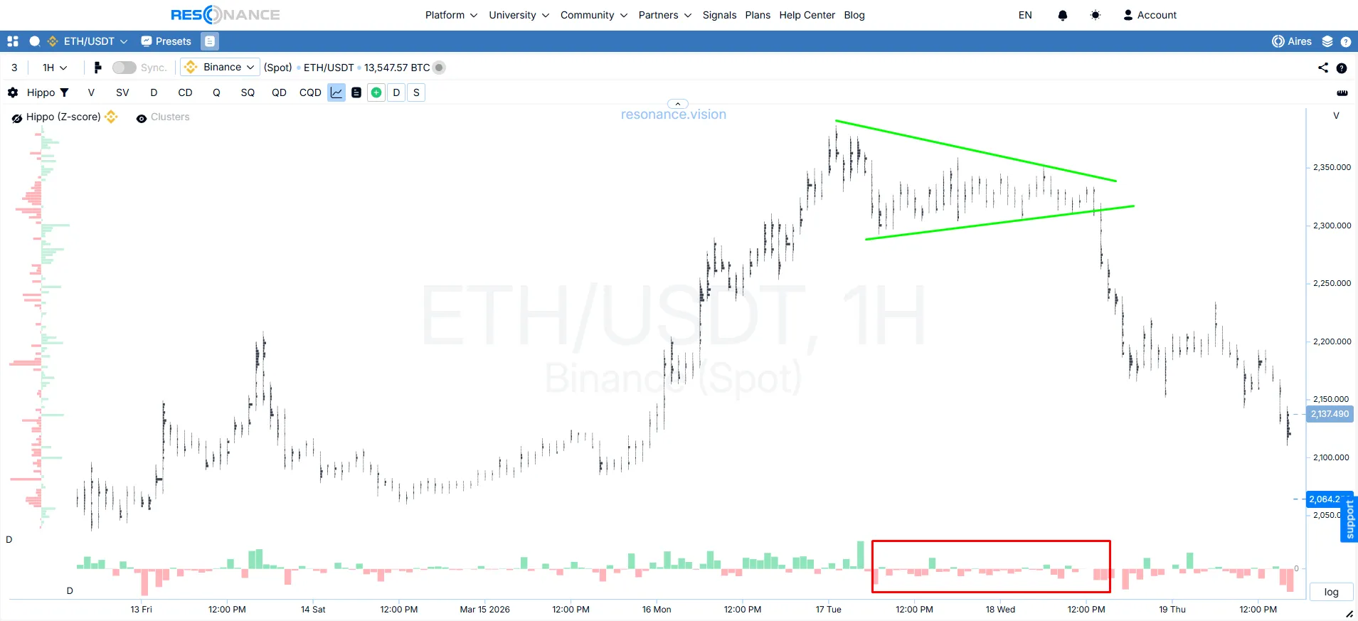
Here is another example of the same pattern. At first glance, the situations look identical, except that this time price failed to break lower.
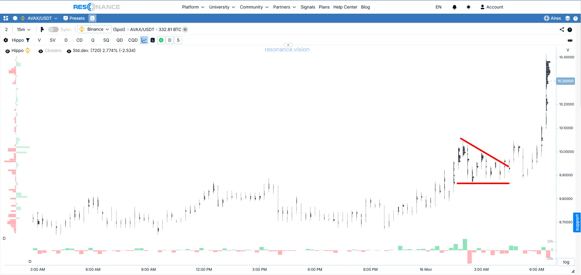
Let us look closer. Selling was actively absorbed by a limit buyer. If we open the heatmap, we will see the buyer’s limit orders holding back market selling, and price could not move lower.
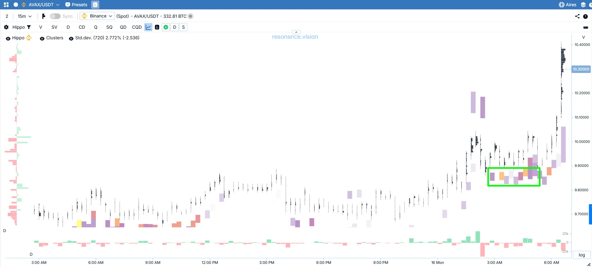
A range formed, and after that price rushed upward.
This pattern is usually treated as a bearish model, but in practice only the result of participants’ actions matters. If there is a lot of market buying inside the pattern and price still does not rise, that demand is being absorbed by the seller’s limits. In that case, the pattern really can end with a move lower: the buyer is active, but gets no real result.
But the situation can unfold in a completely different way. Selling may stay active while price does not decline. If the heatmap shows passive liquidity below, then the seller is being met by a limit buyer. In that case, the same visual geometry gives not a continuation of the drop, but an impulse upward.
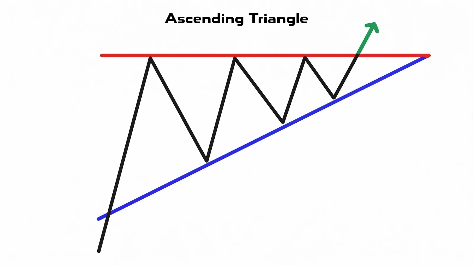
Ascending Triangle
This is the reverse pattern of the previous one. It is considered bullish. Many claim it should also be traded in the direction of the uptrend.
Let us look at a real example and see what is actually happening from the point of view of supply and demand.
So, the coin had been rising for some time and then stopped in a trading range, forming this pattern. Price presses against the upper boundary of the triangle despite the selling that is there (red box) — market selling is being absorbed. Closer to the exit from the range, the market buyer became more active (green arrow) and pushed price upward.
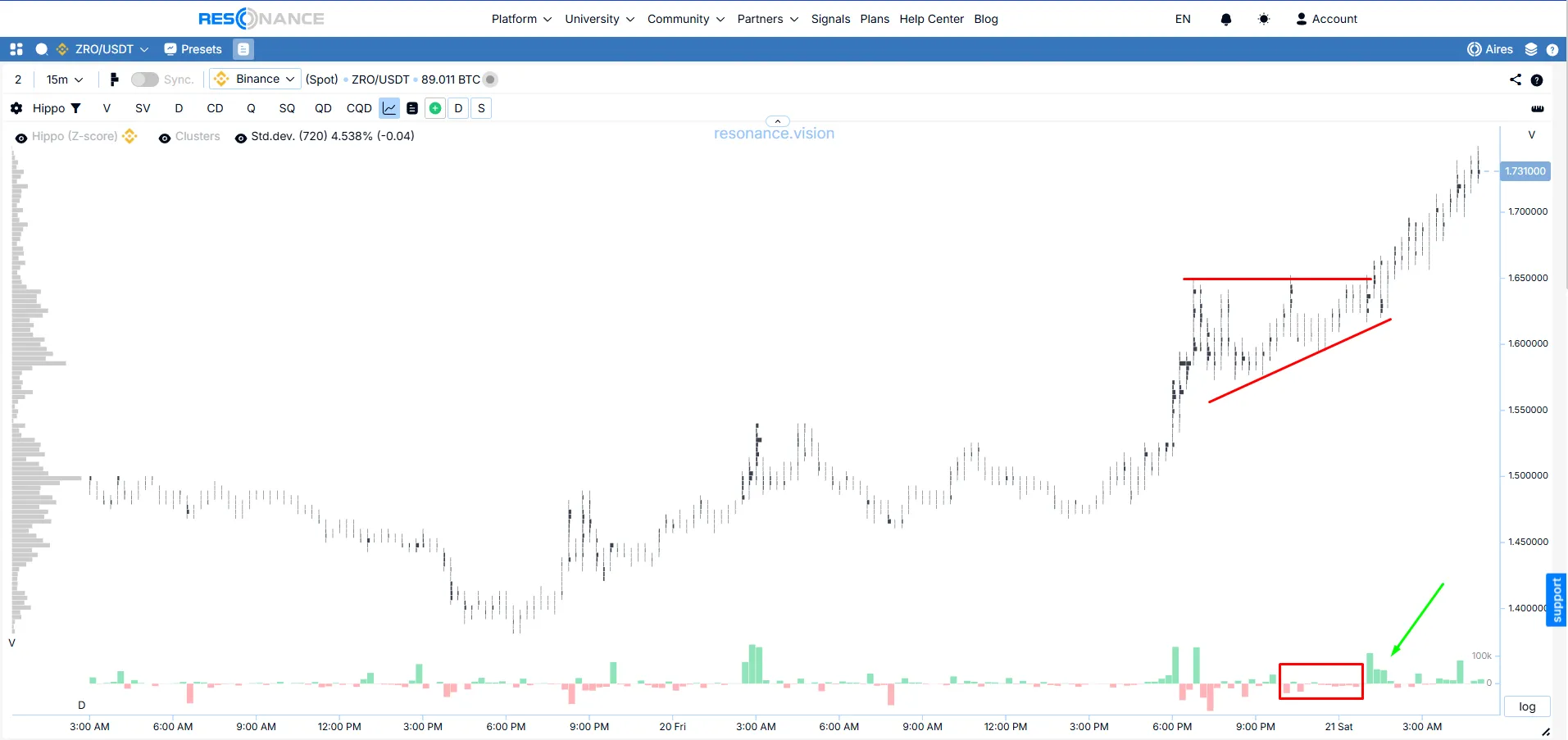
In this example, the buyer remained active and price continued to rise. The breakout upward became a logical continuation of the trend. In other words, market mechanics show that this is a zone of struggle where the buyer both held price with limits and used market buying to absorb all the limit sell orders.
But that is far from always the case. Look at the opposite example. We can see price pressing upward again under the force of market buying. A familiar technical pattern forms. But the buying does not produce a result (blue box and arrow). This is clearly visible on the cluster chart and on delta. Price failed to make a new high. Large cluster accumulations formed, sellers became actively aggressive, and price collapsed.
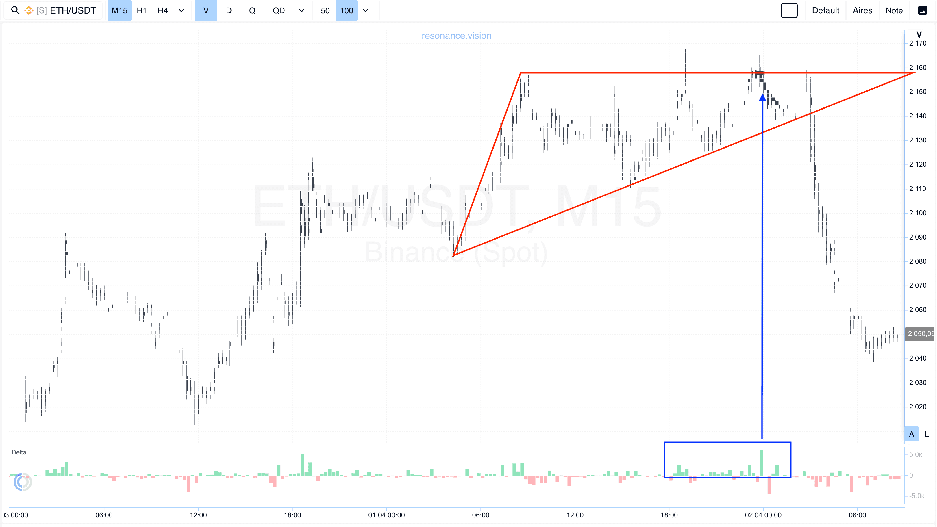
This pattern looks bullish right up to the moment when you look inside the range. If price is really being pressed from below, the limit sell orders at the upper boundary are gradually taken out, and new buying produces a result, then shortage is realized and the move upward is logical. This kind of pattern does not need to be guessed in advance: the cluster chart itself shows that supply is becoming thinner.
But if market buying stays active and price cannot hold above the range, the situation changes. Outwardly, everything looks clean, but in essence the buyer’s effort is being absorbed. Then, instead of the expected move up, price goes in the opposite direction.
Equilateral Triangle
A symmetrical triangle is a state of temporary balance between buyers and sellers. In essence, it is more honest than the previous two models: it promises nothing in advance.
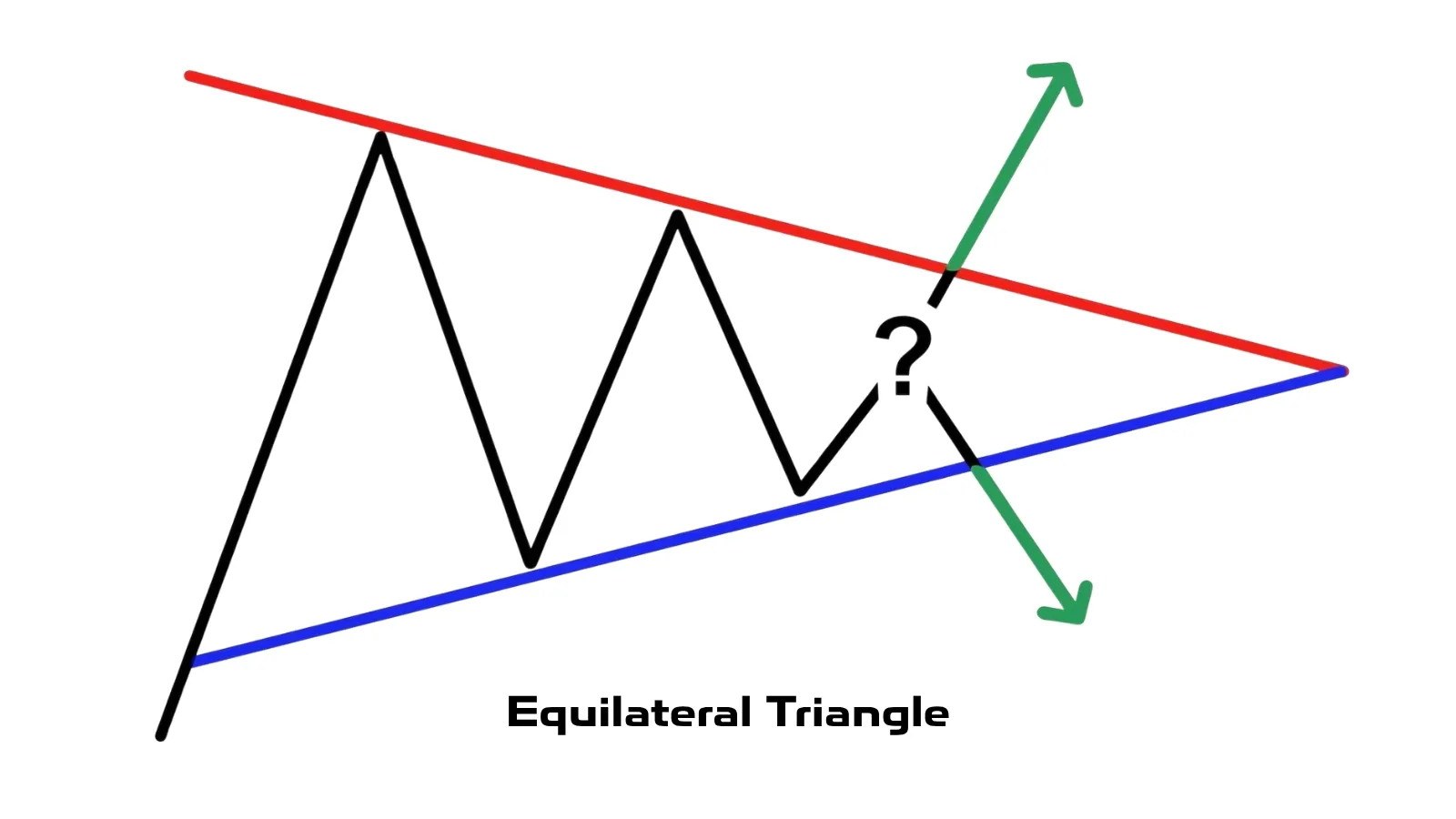
Volatility declines, and participants place their limit orders inside a narrower range.
The market waits until one side shows greater initiative first.
In the example below, buyers showed more market activity (green box). Price made an impulsive move upward out of the equilateral triangle.

This is where traders most often go wrong if they trade only by lines. As long as there is no clear winner inside the range, what we have is not a signal, but a waiting pattern. Without volume confirmation, it is worth nothing.
Now look at the opposite example of an equilateral triangle. Throughout the whole consolidation, market selling prevailed (red box). The buyer tried to absorb all that volume with limit orders, but we never saw real market activity from that side. The seller kept pressing, and price did not hold.
Takeaway
What to Look at Instead of the Shape
To avoid trading blindly, it is enough to ask a few questions.
What happened before the pattern formed: growth, decline, or a range?
Whose active actions produce a result: buyers or sellers?
Where is the passive liquidity that may hold the move?
And is there absorption of market buying or market selling — that moment when aggressive volume exists, but price barely moves?
The direction of the price move is determined not by the shape of the triangle, but by the imbalance of supply and demand and by the reaction of price to volume. What matters is the analysis system. There is no triangle trading indicator that can replace this logic. A working system starts with these questions, not with blind faith in lines.
Cluster charts show the zones where buyers and sellers actually fight.
The heatmap helps you see limit orders that can hold back aggressive market orders.
Price charts, delta, and the screener save time and help you search for trade ideas quickly and as a system. For crypto setups, this is much more useful than trying to find a magical signal.
Conclusion
A triangle in trading is useful not as a standalone signal, but only as a reason for deeper analysis. No pattern can objectively predict the future price move. If you focus only on the shape, any technical analysis triangle trading strategy quickly turns into trading by guesswork. What determines direction is not geometry, but the imbalance of supply and demand. And that is what separates working crypto analysis from trying to trade patterns on charts by the brochure.
Follow new insights in our telegram channel.
No need to invent complex schemes and look for the "grail". Use the Resonance platform tools.
Register via the link — get a bonus and start earning:
OKX | BingX | KuCoin.
Promo code TOPBLOG gives you a 10% discount on any Resonance tariff plan.
Recommended articles


